
Thursday 20 February 2014
Sunday 16 February 2014
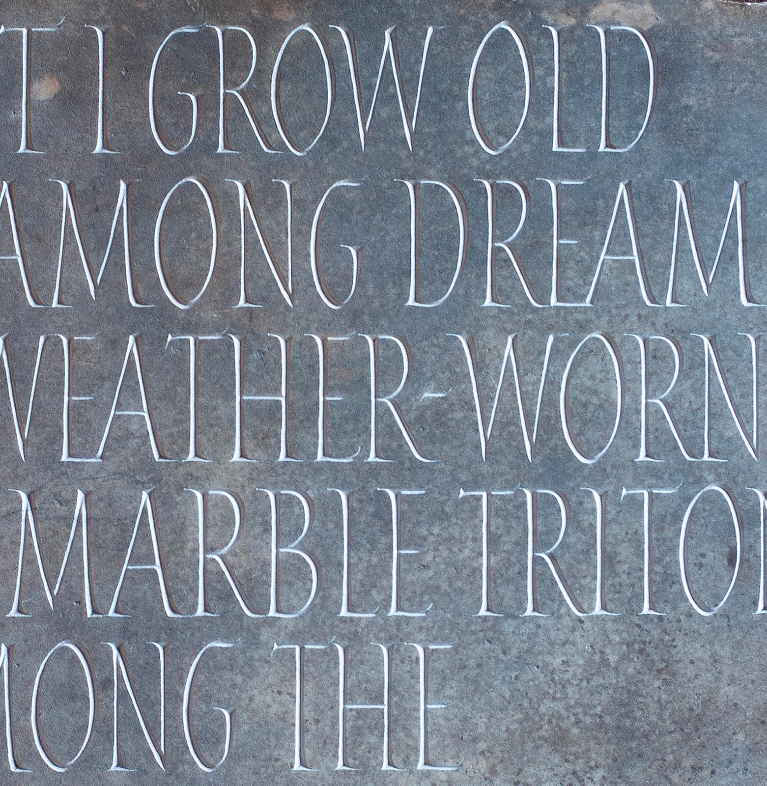
Roman Alphabet.

This alphabet is the latest incarnation of a letter form that I have been working on with a good friend Eric Marland. I'm lucky enough to have collaborate on a few projects like this one with Eric, he's an amazingly talented letterer with a breadth of knowledge about letter form that I envy. He shares my passion for letters (his wife Renee has christened us and a few like minded travelers "the lettering bores" a title I wear with pride).
These letters are based on classical forms that are neither Roman caps as we think of it, nor Rustic but are somewhere in-between. Our minds tend to think only Roman letters as either being imperial caps or rustic, but the Romans produced every shade in between and often on the same plaque. These letters are based on just such letters.
 |
| sketch in stone. |
 |
| drawing for the Alphabet. |
 |
| Original prep drawings. |

Thursday 13 February 2014
Stuart Emms

The other day I was in Providence, a shop in town, and the owner showed me her web site . At the top of the page was a beautiful painted sign that the shop had used when it operated out of a market stall. She asked me if I knew Stuart Emms who was the sign writer who had painted it, I had to admit that I did and that I am staying with him (and his wife Geddy) at the moment.
I first met Stuart, fifteen years ago, when I happened on him painting a shop sign on Mill Rd, I sat down on a wall across the road and watched him work for an hour or so (I wasn't busy that day), we got talking and have been friends ever since. His studio was in Neils Yard, two minuets walk down the road from my then home & studio and I'd step down there during a break to scroung a cup of tea and a fag. He was acknowledged as the best sign writer in Cambridge right up to the time when he retired and his brush work is still brilliant and inspiring to see.
 |
| Stuart Emms. |
I've come to love brush lettering. I read Father Catiches "Origin of the Serif" back in 2000 and since then I've been playing with brushes. Before I discovered painting letters I would draw out the design, refining and refining, often I came to think that I'd refined the life out of the original idea. Now I'll work the drawing to a point where I'm happy with the spacing and proportion of the letters and then run a brush through it, bringing back life and freshness to the design. Before I went to America I used the chisel ended brush and then, in the US, I was introduced to the ticket writers brush at the JSS. Recently I've just started playing with sign writing brushes and if coming to grips with the ticket writers brush was difficult the sign writers brush is a hundred times more troublesome. Each of these brushes have different strengths and I think they improve my work as a Letterer.
Just along the road from Providence is a row of shops where the college landlord insists that the signage is sign written instead of the now more normal industrially produced crap. A haven from the rest of the town which is littered with soulless computer designed plastic shit and corporate logos that bear no sympathy with the buildings that they're inflicted on. There's something very human about a beautifully sign written work and I challenge any one to find more charm in the industrial alternative. In the lettering community sign writing was always the poor relation, but I think that now that its lost the battle with computer designed signage and is becoming rarer and rarer to find, I think its status will rise and the rest of us will realize how much we lost with its disappearance from our streets.


Saturday 1 February 2014
Italic alphabet.

For the last three decades I've been in love with alphabets. Ever since I ducked into Heffers gallery out of a rain shower and chanced into David Kindersley's "12 alphabets" show. This was a show of his experimental alphabet that he did in seventies, done as screen prints. At seventeen I knew I wanted to be an artist but was rather vague about what that actually meant, it probably amounted to some romantic ideas about bohemian life style and little else but whether as a painter, graphic designer or, god help me, a performance artist was any bodies guess, I didn't know. I felt an instant affinity to those prints and their subject matter, I responded to the abstract nature of letters. I can't say that I understood them on any deeper technical level then and not for many years to come but I knew what I wanted to do and have pursued that dream ever since.

I love designing, painting and carving alphabets. The alphabet gives me the same intellectual challenge as a cross word puzzle does for some other people. A problem to be solved in as elegant and harmonist way as possible. To create a unified whole out of twenty six smaller parts. I love the logic that dictates that if this letter has these qualities then other letters will share them. I love that although it remains the same twenty six characters and in the same order, it can be done in hundreds of different way. Slight changes creating different accents, different moods. I love exploring all the variations and I've been doing it ever since wandering into David Kindersley's "12 alphabets" shows.

Some ten years later or so, I was working for David Kindersley's widow Lida, at the Cardozo Kindersley workshop. I told her how that exhibit had focused my life, how from that day I'd started me drawing and thinking about letters and set me on the path to becoming a lettering artist. Later that day Lida gave me one of the prints, a beautiful red and maroon alphabet base on the Lombardic letterform. I've had it framed and its on the wall of my living room, I very fond of it and it still has the power to inspire me.
Subscribe to:
Posts (Atom)